The pages a restaurant website needs
- Home. Your best photo across the screen, your name, your hours today and one button to order or call.
- Menu. Every dish with its price and a short description, in your sections, with photos where you have them.
- Our story. Who you are and how you cook, with a photo of your place. People like to know who feeds them.
- Gallery. Your food and your room, large and sharp.
- Visit. Your map, your opening hours and a phone number that calls with one tap.
- Order online. Your own pickup ordering, and your delivery apps next to it.
Only make a page when you have something good to put on it. An empty Catering page does more harm than none.
Photos: your own, large and real
People choose food with their eyes. Use your own photos of your real dishes and your real room, big enough to fill a phone screen. Stock photos look like every other website, and customers notice when the plate they get is not the plate they saw. A dish with no good photo is better as a clean line of text than with a dark, blurry picture.
The menu: text first, not only a PDF
A menu as text, with prices, is easy to read on a phone, easy to search and easy for Google to understand. A PDF has to be downloaded, zoomed and scrolled sideways. If you love your printed menu, keep the PDF as an extra, under the text menu.
Keep the menu true: the same dishes and prices as in your restaurant and on your delivery apps, and mark what is sold out.
Made for phones
Design every screen for a thumb. Big buttons, short lines of text, and a bar that stays at the bottom with Call and Order. Your hours for today, not a table of the whole week, on the first screen. A phone number that is a link, so one tap calls you.
Fast to open
A hungry person does not wait. Photos sized for the screen and saved in modern formats, few scripts, and no video that plays by itself with sound. A fast page is also kinder to people on a weak signal.
Ready for Google
- A clear title and description on every page, with your restaurant's name, food and city.
- Your menu, opening hours and address as data Google can read, and a sitemap.
- The same name, address and phone number as on your Google Business Profile.
- A map on your Visit page.
This makes your site easy for Google to understand. Google decides the ranking, so nobody can honestly promise a position.
Your brand, not a template
Take your colours from your logo and your photos, choose type that fits your food, and keep one main button on each screen. A burger bar and an evening dining room should not look the same.
Our 8 live example websites
Each one is a real website you can open and click through, in a different design. Open one on your phone too.
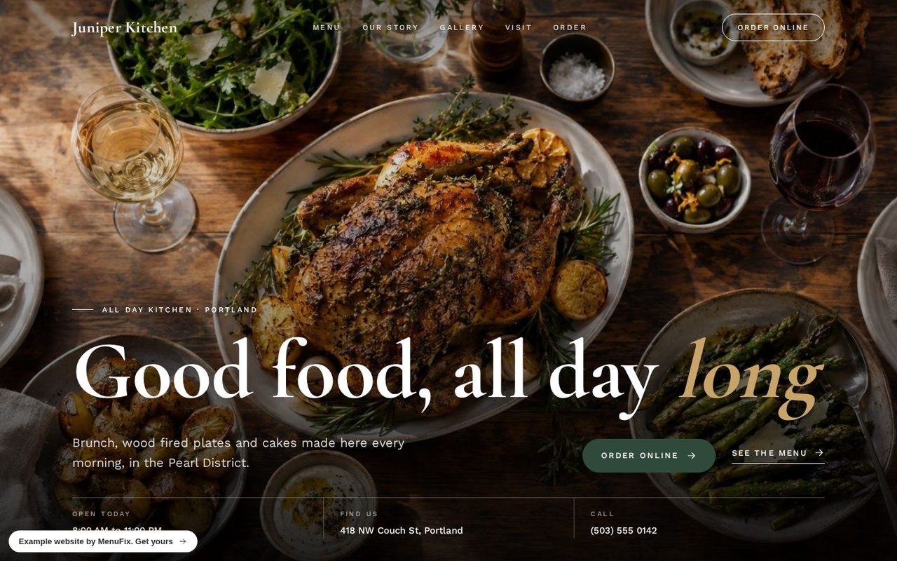 Juniper KitchenClassic design · All day kitchen, Portland
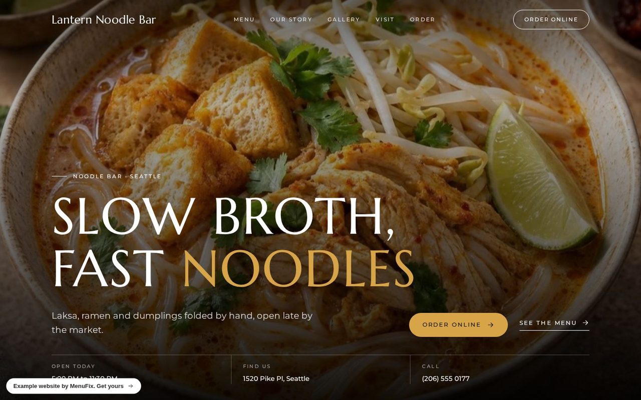 Lantern Noodle BarNoir design · Noodle bar, Seattle
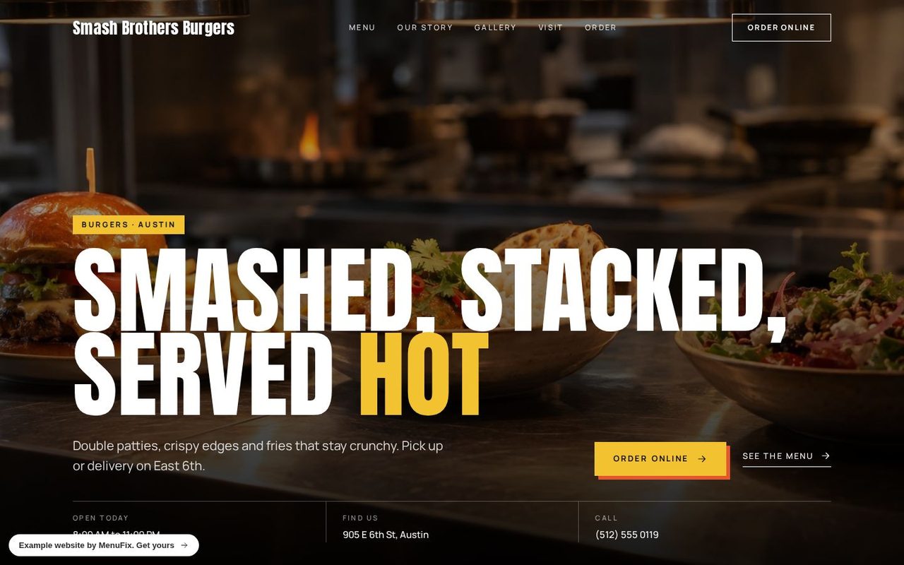 Smash Brothers BurgersBold design · Burgers, Austin
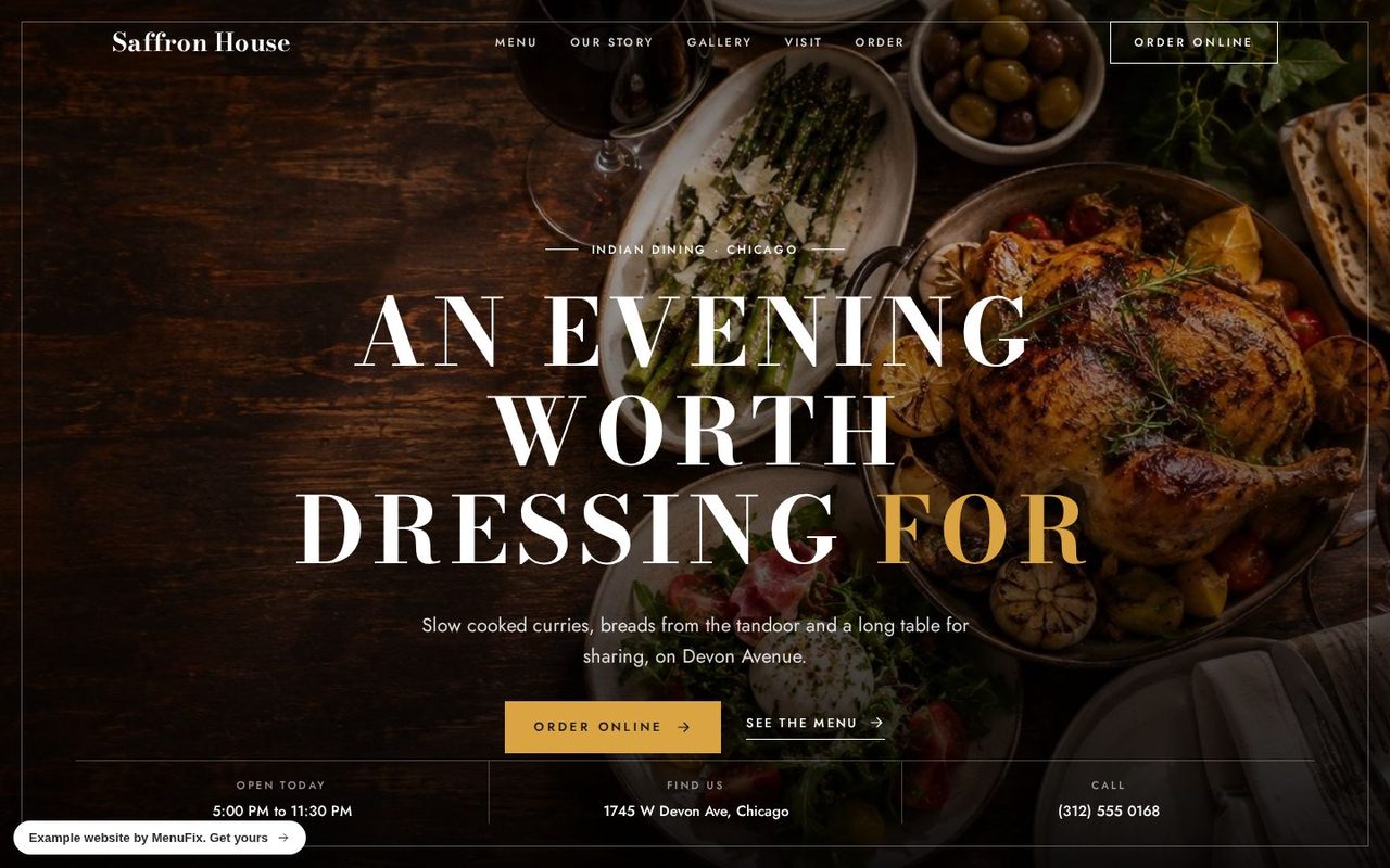 Saffron HouseLuxe design · Indian dining, Chicago
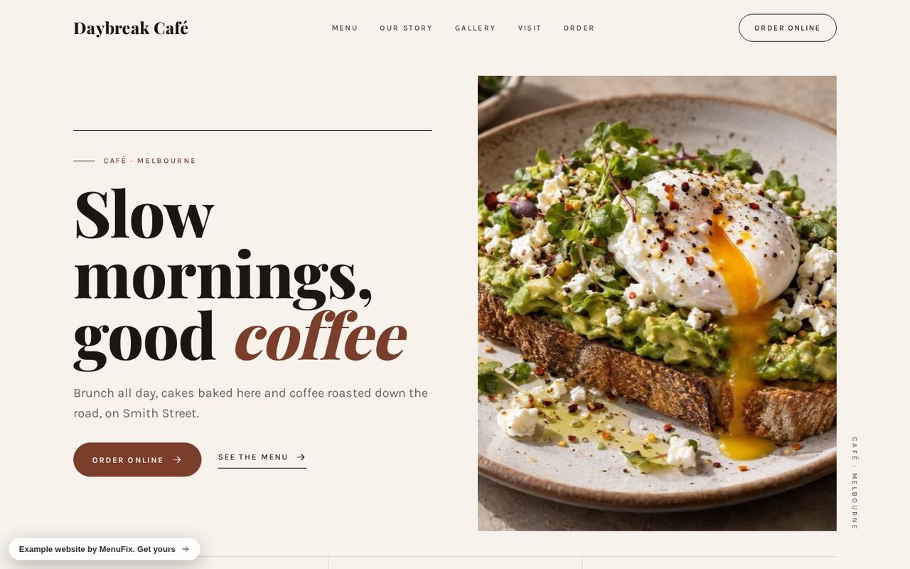 Daybreak CaféEditorial design · Café, Melbourne
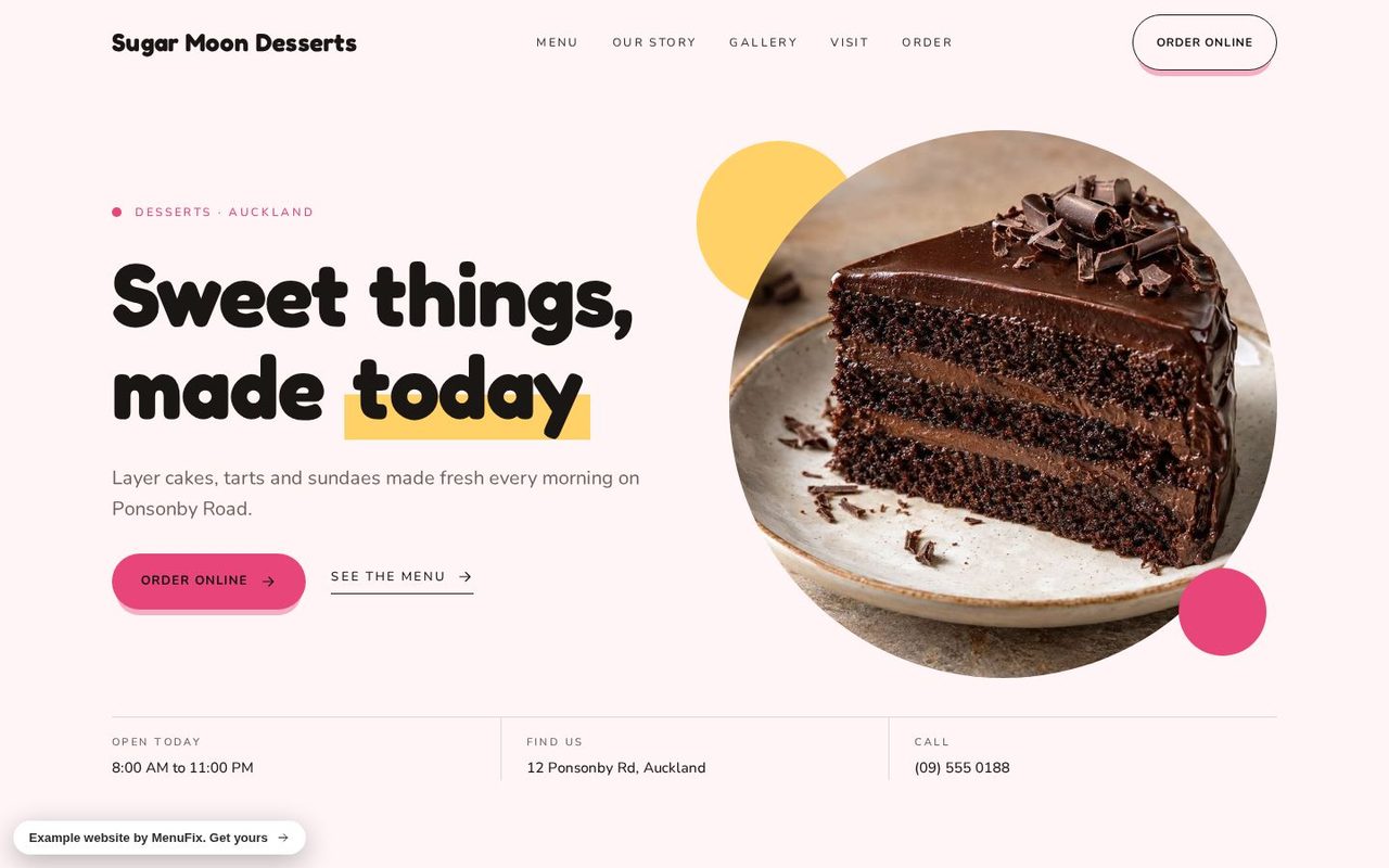 Sugar Moon DessertsPop design · Desserts, Auckland
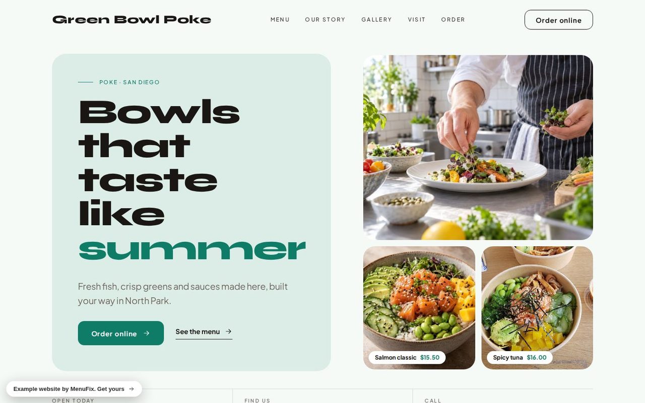 Green Bowl PokeFresh design · Poke, San Diego
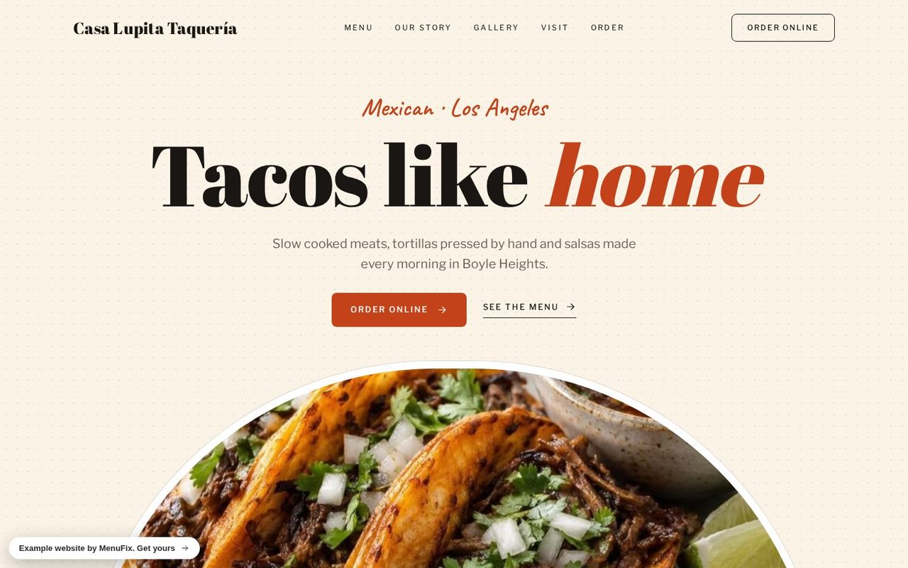 Casa Lupita TaqueríaMarket design · Mexican, Los Angeles
Every restaurant above is made up to show a design: the names, dishes and prices are examples.
See them all with their phone views on our restaurant website examples page.
Get your restaurant's website designed for you
Type your restaurant's name or paste your Uber Eats or Instagram link on our website maker. We make every page from your own photos and menu, in your colours, and you see the free preview first, with no card. Keeping it live is US$99 a month in the United States, with hosting, your domain, your own ordering page and changes included.